Capital Craft Beverage Trail Passport & Poster 2020
GOAL: Showcase all CCBT producers in a format that is organized, informative, interactive and easy to use.
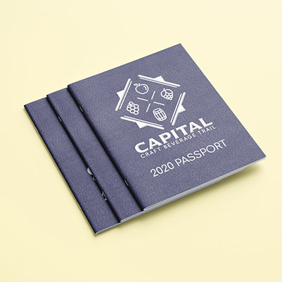
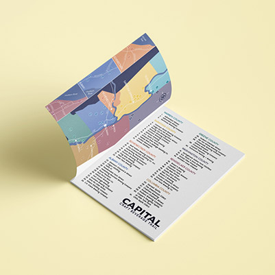
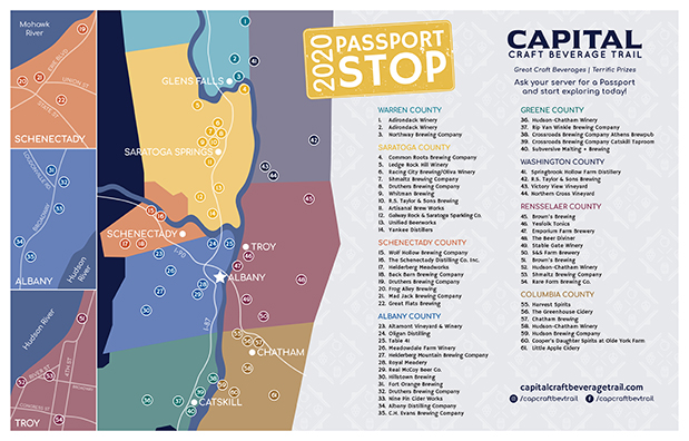
CHALLENGES: The number of participating producers has doubled since the Passport's inception, from approximately 25 producers to 52 producers with 61 locations. Budget and production factors limited the page count, and the client wanted to stick to a pocket-sized "passport" format. Prizes awarded at various progress points throughout the Passport require a solution for redemption that does not require entire Passport to be submitted.
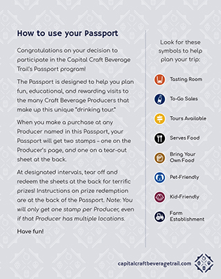
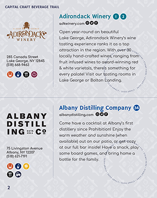
SOLUTION: All producers were allotted a half page listing in the Passport. They were given a recommended character limit for their location description; priority was given in each listing to pertinent information such as address, website and phone. Quick reference icons indicating specific features or offerings, and numeric icons for each producer match their marked location(s) on the custom Trail map at the front of the book. Tear-out pages in the back of the book allowed customers to redeem their stamps for prizes throughout the trail, while keeping the main body of the book as a souvenir of their journey if they wished.
Bank of Greene County 2020 Annual Report
GOAL: Communicate to shareholders the impact that the Bank had in the community in the early stages of the COVID-19 pandemic and convey their success over the past fiscal year.
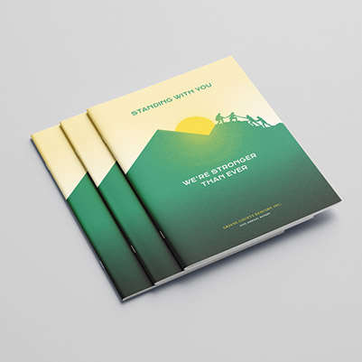
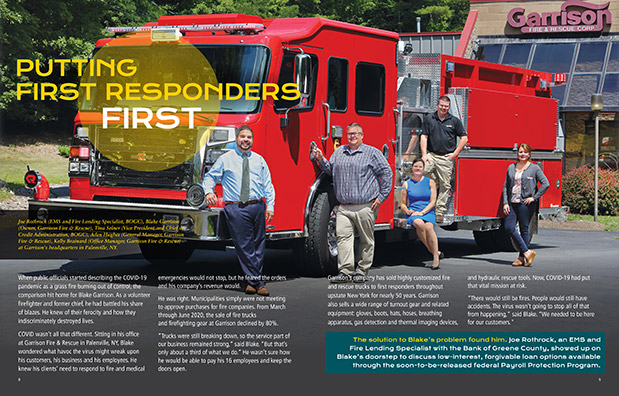
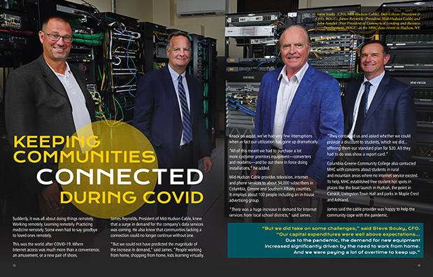
CHALLENGES: The pandemic has been a difficult time for many, so everything needed to be presented tactfully and not overly self-aggrandizing. Needed to avoid representing the Bank as a savior of the community. Due to safety concerns, photo shoots for this year's report were short and participants were socially-distanced, and resultant photos reflected this.
SOLUTION: Cover illustration is a play on the Bank's logo (a mountain silhouette in front of a rising sun) that features a number of people all working together to ascend, as a representation of the Bank's role in working together with the community to get through this challenging time. The group is nearing the lower of two peaks, to symbolize that the challenge is not over. The yellow sun graphic is carried through the report, to symbolize hope and optimism for the future. Client stories featured tightly-cropped, full spread photos to create a more dramatic, dynamic feel and to draw readers in.
IPH Food Bank Direct Mail Appeal
GOAL: Increase donations to Food Bank Appeal.
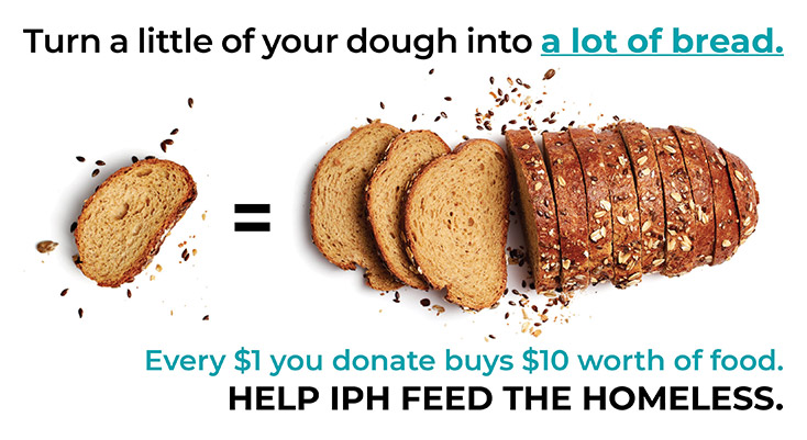
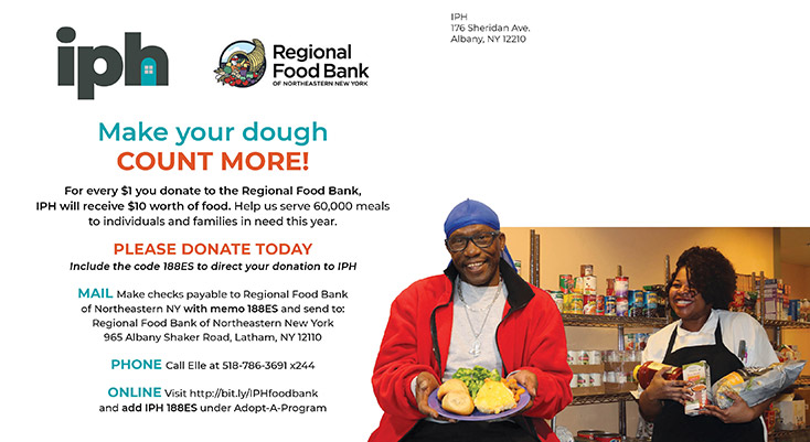
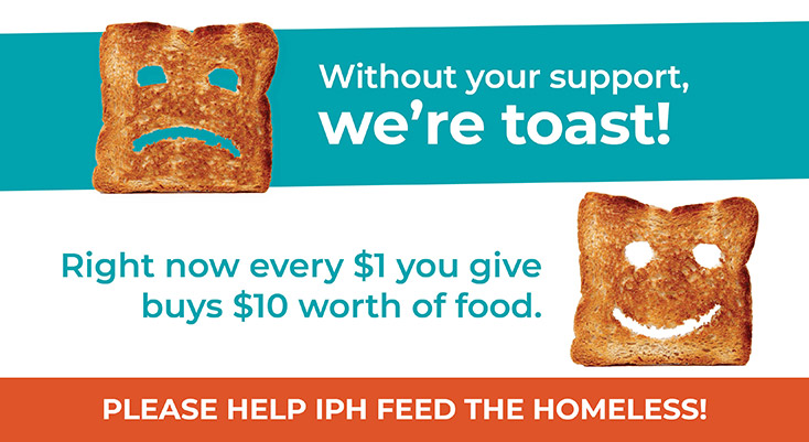
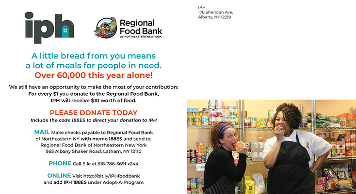
CHALLENGES: Previous years' mailers have brought in fewer donations than expected. All were designed with fun, food-themed messages, but failed to bring in donations from a house list of previous donors. Client loves the food theme!
SOLUTION: Format was switched from a card in an envelope (which communicates nothing if it doesn't get opened) to a 6x11 postcard. The messaging was switched up to emphasize the exponential value of a donation to this particular campaign (a fact that was mentioned as an aside previously) to drive home that even a small donation would be impactful. Client reported that they did see an increase in donations this year and were thrilled with the results.
Noodle Doodles Cranial Band Wrap Program
GOAL: Put together a fun, streamlined program to offer to families facing plagiocephaly.
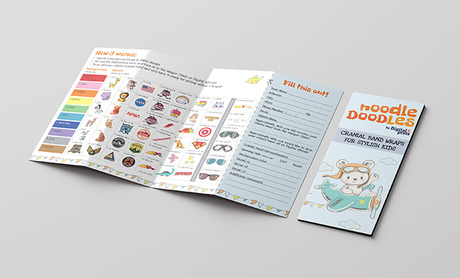
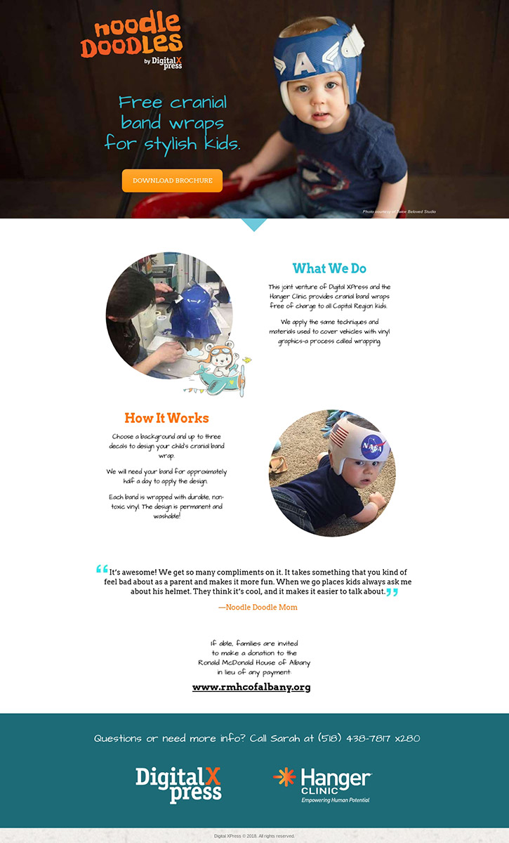
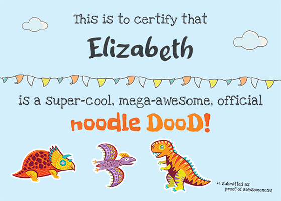
CHALLENGES: Graphics would be applied using adhesive vinyl (the kind used for vehicle wraps) so installation process limited how artwork could be designed—the cranial bands are so round that the vinyl needs to be stretched quite a bit and any large or complex graphics would get distorted. Needed to offer a quick timeline for installation so that families would be able to begin their cranial band treatment with as little disruption as possible. Program should be simple, straightforward and welcoming to encourage participation.
SOLUTION: Working with Production team, a process for quick installation was devised: rather than printing a single piece of vinyl to be applied to the cranial band all at once, a background color would be applied first with the main artwork being produced as individual decals. This allowed the background to be stretched as needed for installation, and then the more complex graphics to be applied without distortion. After researching various homemade cranial band designs, a library of design options was curated for parents to choose from.
Plagiocephaly is treated by age 1 for most children, so program name and branding reflect a whimsical and fun program. Giving families and opportunity to decorate their child's cranial band removed a lot of the stigma they felt prior to the program's development. Parents reported that the Noodle Doodles program made the medical diagnoses much less stressful and intimidating.
Learn more about the program at noodle.dxp1.com.
Digital XPress Open House Logo & Invitations
GOAL: Inform and invite customers to a fun, educational open house event that seeks to reposition print shop as a knowledge leader and reiterate the value of direct mail in marketing.
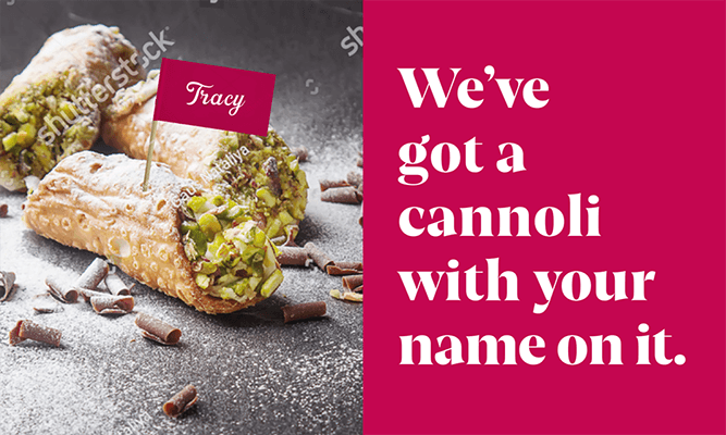
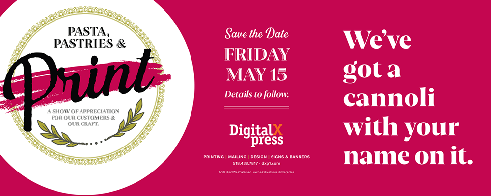
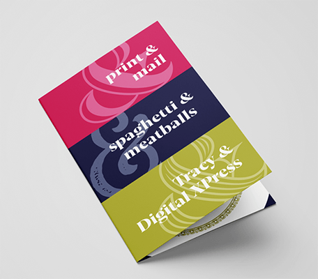
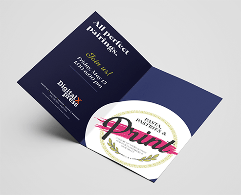
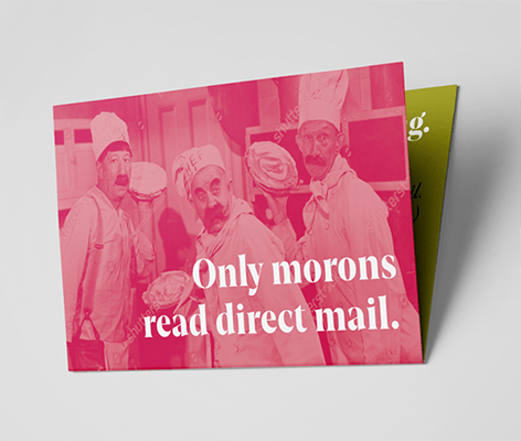
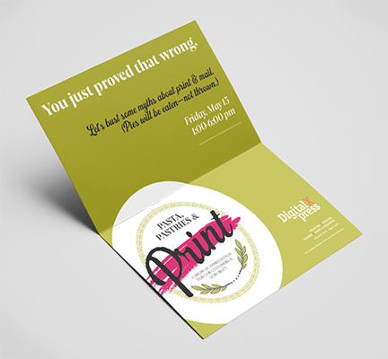
CHALLENGES: Past open house participation has been low. Budget & production limitations narrow resources and format options. Create a series of mail pieces that are eye-catching and incorporate variable elements.
SOLUTION: Draw them in with food, a bright color palette and bold type! The open house was to feature Italian food from a local restaurant, so a brand was developed for the event that incorporated this. All mailers were designed to be slightly mischievous with large headlines and bright graphics/photos to grab the attention of the recipient. Each 6x11 postcard incorporated a foldover element (either half-fold or short-fold) to create an engaging experience.